Published project

ChillMind

Making contrast therapy easier to understand and book

Year
2025
Industry
Wellness & Therapy
Scope
Branding
Timeline
1 month
Images
9 published
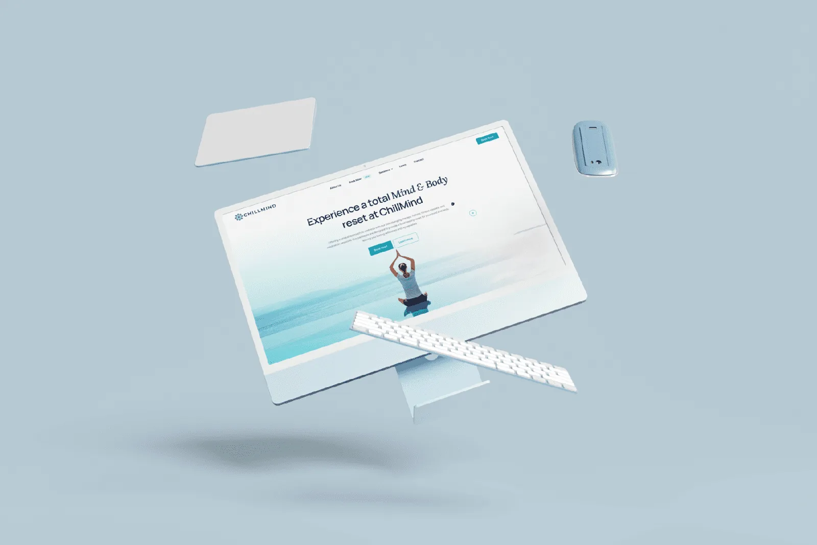
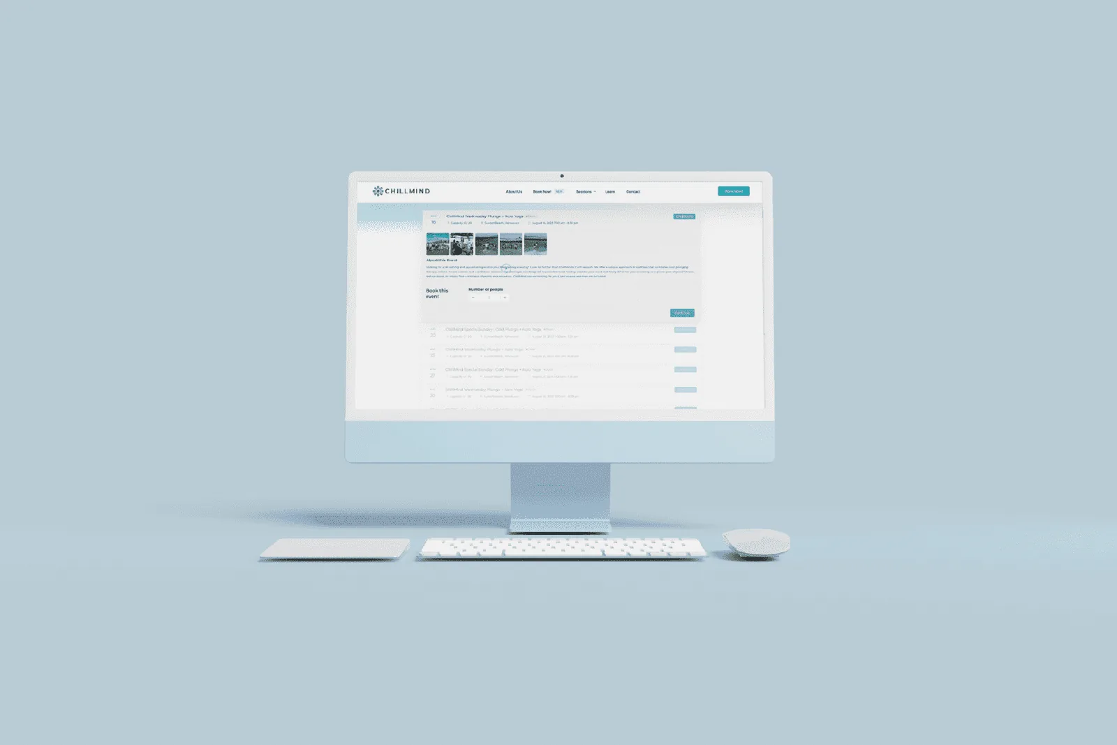
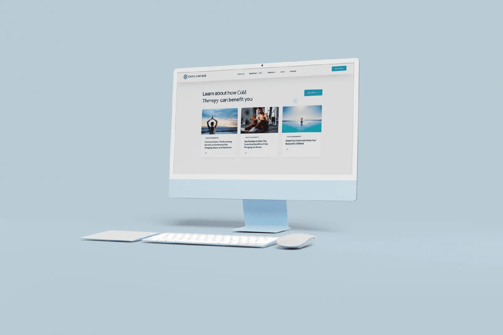
ChillMind wellness platform presented as a floating desktop interface
01

Starting condition

What needed to change

An intense physical experience needed an introduction that felt calm, understandable and welcoming to first time visitors.

ChillMind combines sauna, cold immersion and breathwork within a service that many people have never tried. Visitors needed to distinguish between classes, solo plunges and packages, understand what each option involved and feel comfortable moving into booking. The digital journey had to reduce uncertainty without over-explaining the experience or making claims that belonged in a clinical rather than a studio context.

Executive summary

Summary

Business condition
An intense physical experience needed an introduction that felt calm, understandable and welcoming to first time visitors.
Organizing decision
The identity and service menu work together to turn an unfamiliar offer into a straightforward set of choices.
Studio contribution
Brand Identity & Service Experience
What you can inspect
The work, and the decisions behind it.
03

The decisions

What was decided, and why

The thinking, as it was published.

  1. ChillMind combines sauna, cold immersion and breathwork within a service that many people have never tried. Visitors needed to distinguish between classes, solo plunges and packages, understand what each option involved and feel comfortable moving into booking. The digital journey had to reduce uncertainty without over-explaining the experience or making claims that belonged in a clinical rather than a studio context.

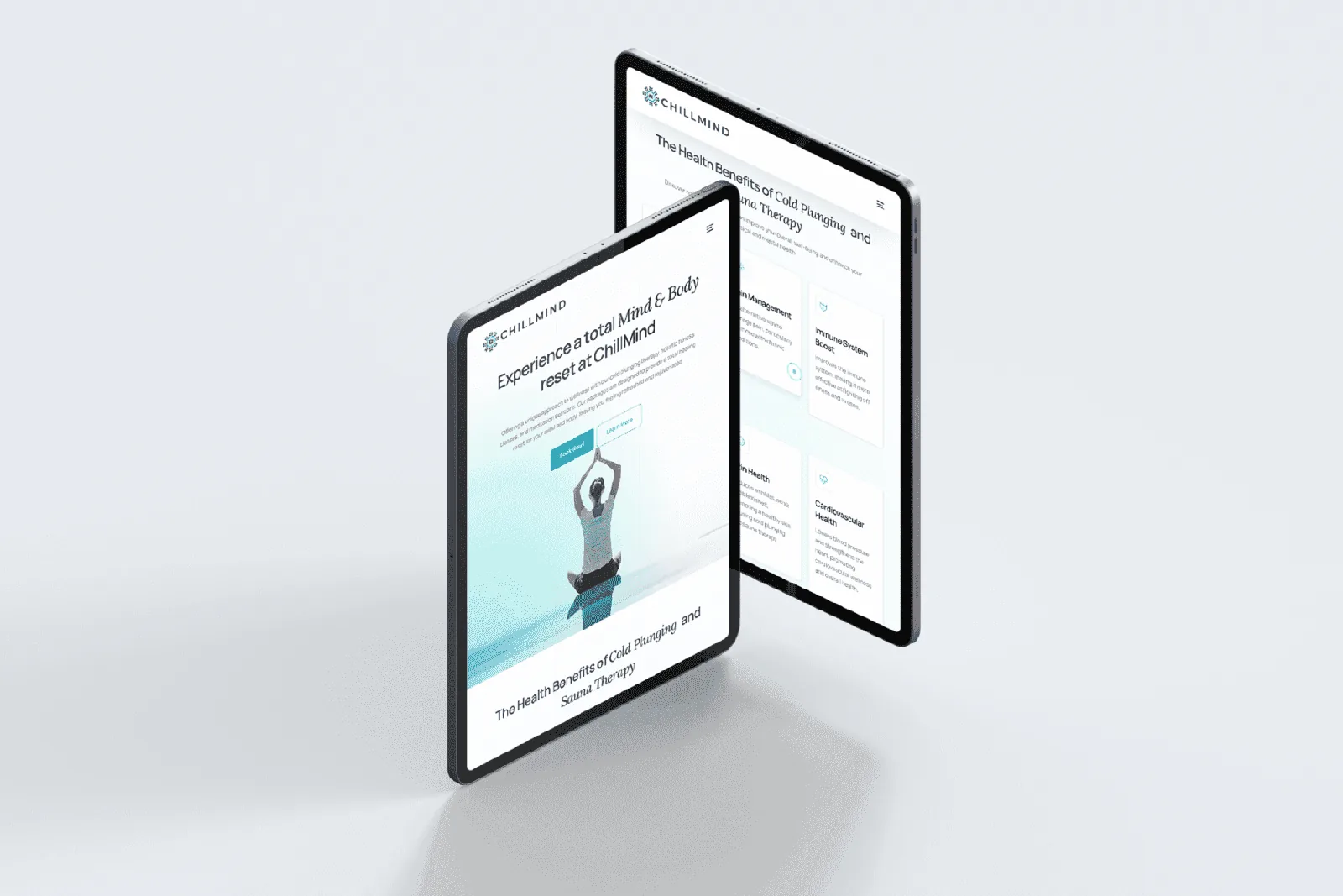
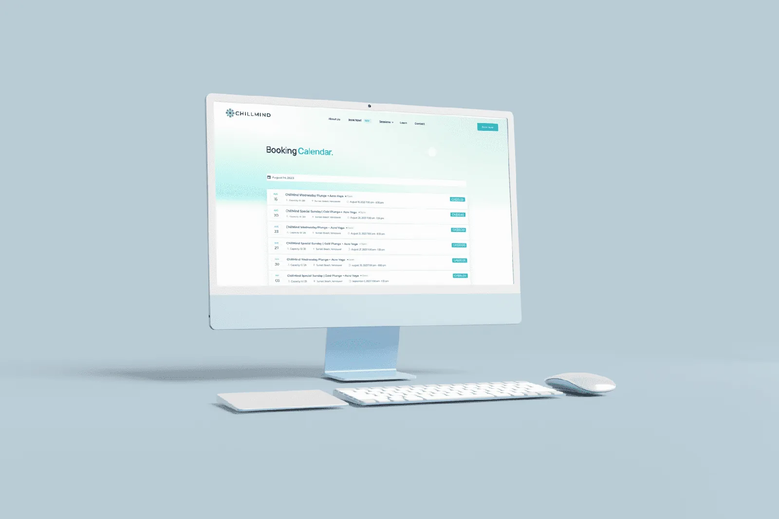
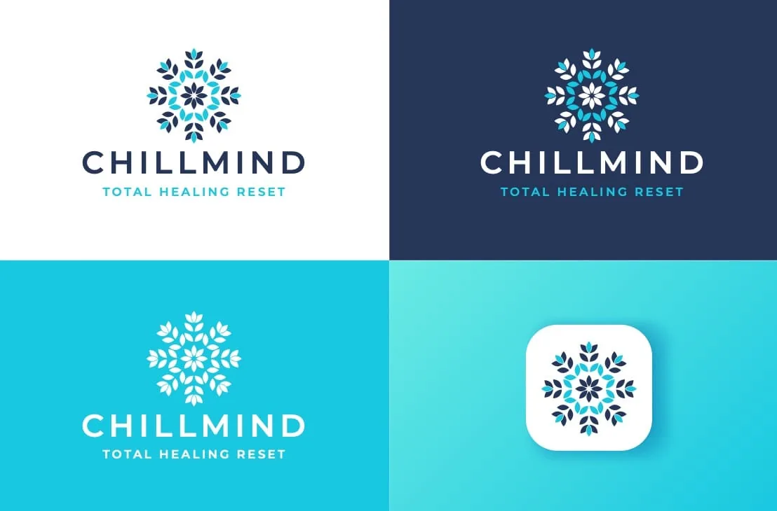
  2. Visual identity, UX architecture, booking integration and service design were organised around a more reassuring customer journey. Snowflake geometry and a mandala inspired structure express contrast, clarity and stillness without relying on generic spa cues. Within the interface, classes, plunges and packages are separated clearly, giving visitors a coherent path from first explanation to the option that suits their intended visit.

  3. We mapped the questions a new visitor is likely to have, then used service naming, concise explanations and calm visual cues to answer them in sequence. Booking interactions were kept direct so interest did not turn into unnecessary friction. The resulting platform gives ChillMind a consistent launch presence and a more useful way to introduce contrast therapy while keeping the limits of the website's role clear.

02

Design response

The organizing idea

The identity and service menu work together to turn an unfamiliar offer into a straightforward set of choices.

Visual identity, UX architecture, booking integration and service design were organised around a more reassuring customer journey. Snowflake geometry and a mandala inspired structure express contrast, clarity and stillness without relying on generic spa cues. Within the interface, classes, plunges and packages are separated clearly, giving visitors a coherent path from first explanation to the option that suits their intended visit.

03

Published process

How the work moved

Heat, cold and breath became a practical framework for hierarchy, tone and interaction design.

We mapped the questions a new visitor is likely to have, then used service naming, concise explanations and calm visual cues to answer them in sequence. Booking interactions were kept direct so interest did not turn into unnecessary friction. The resulting platform gives ChillMind a consistent launch presence and a more useful way to introduce contrast therapy while keeping the limits of the website's role clear.

04

System delivered

01Brand Identity & Service Experience

I had the best experience working with [Dave Curtin]. [He was] easy to communicate with and efficient with every adjustment I asked for on my website design. I totally recommend [him] to everyone looking for this kind of service.

Ricardo TrevinoCo-FounderChillMindRead the original
05

Evidence standard

What we publish

Published work, with its source.

This profile carries the complete published project image set and identifies its source. Commercial results and third-party endorsements appear only when their source and publication status are clear.

Original published case record
Next project

Metaltech

A clearer technical product story for aviation procurement teams

Metaltech ground-support website displayed on a phone in a rugged black settingView case

Planning a patient-facing site?

If people need to find a service, understand it, and act on it, the structure matters more than the styling. That is where this usually starts.

Discuss a similar projectBack to all work